The Challenge
Commuter rail apps are failing us. They are not user friendly and yet, they are so needed! As more and more people commute to Boston for work, supporting people during this experience becomes critical. Here is an approach to re-designing a commuter app for enhancing commuters experience.
Some Issues
Not cellphone-friendly
Navigation system like website
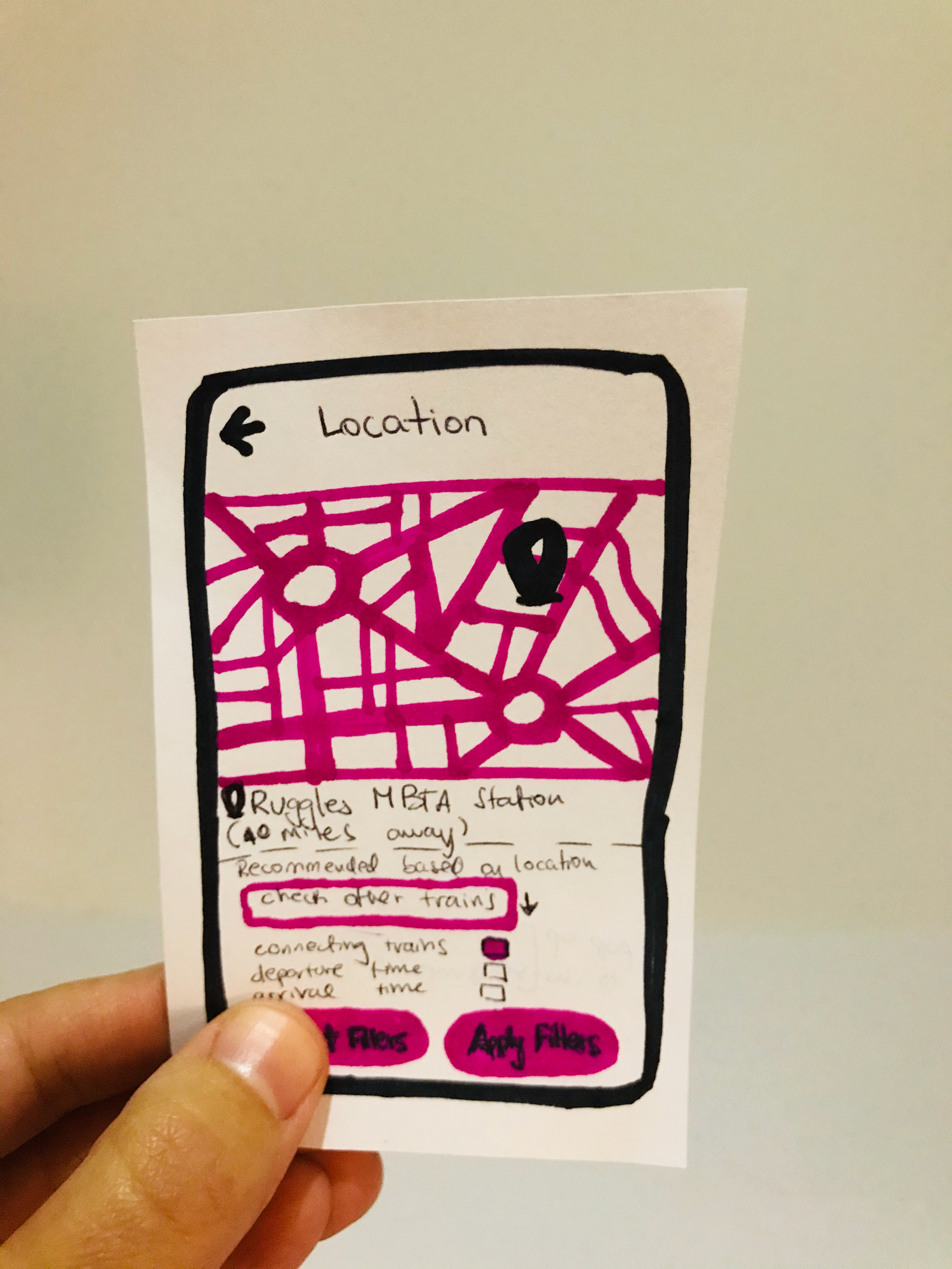
Map is hard to visualize & navigate
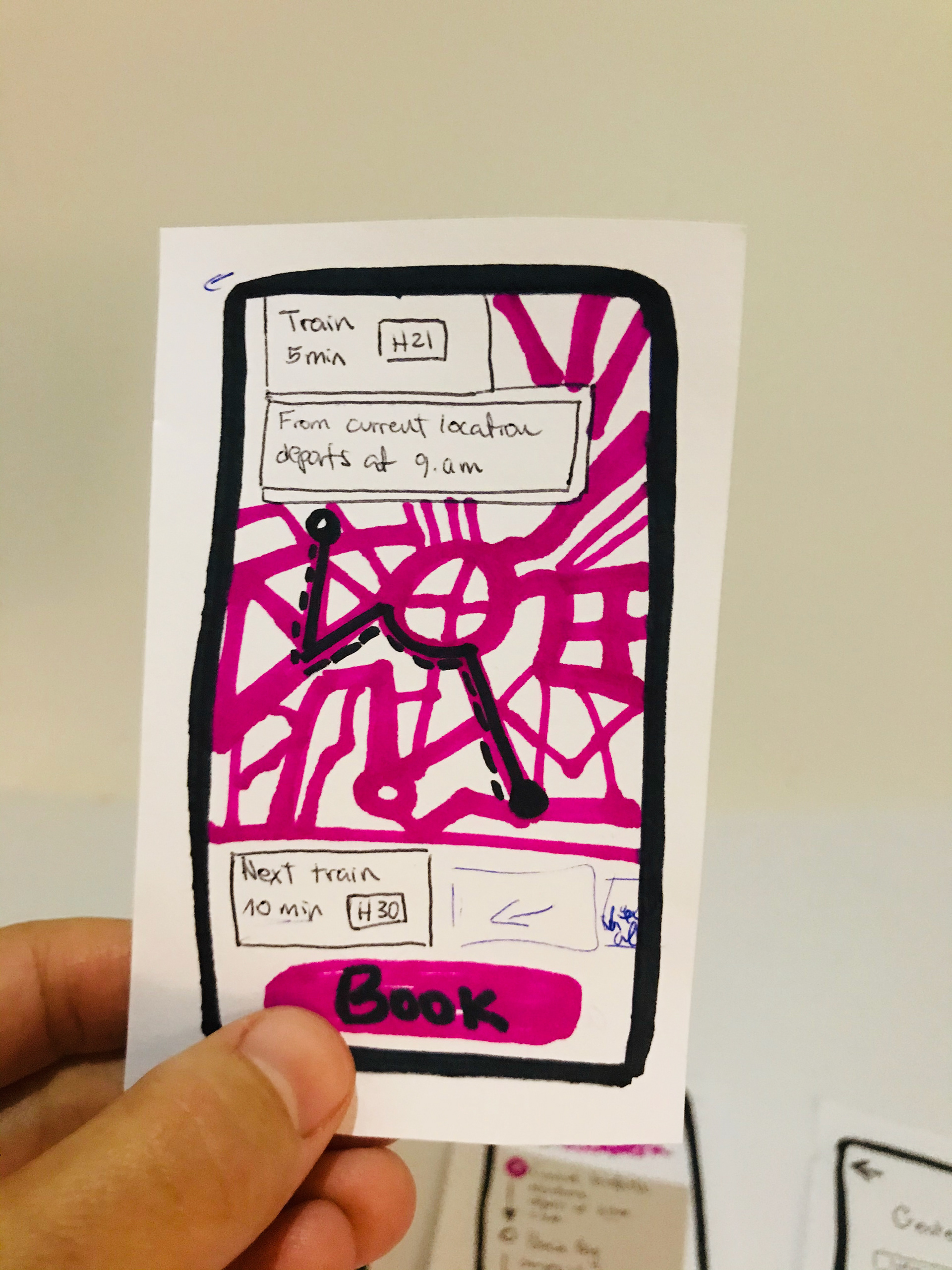
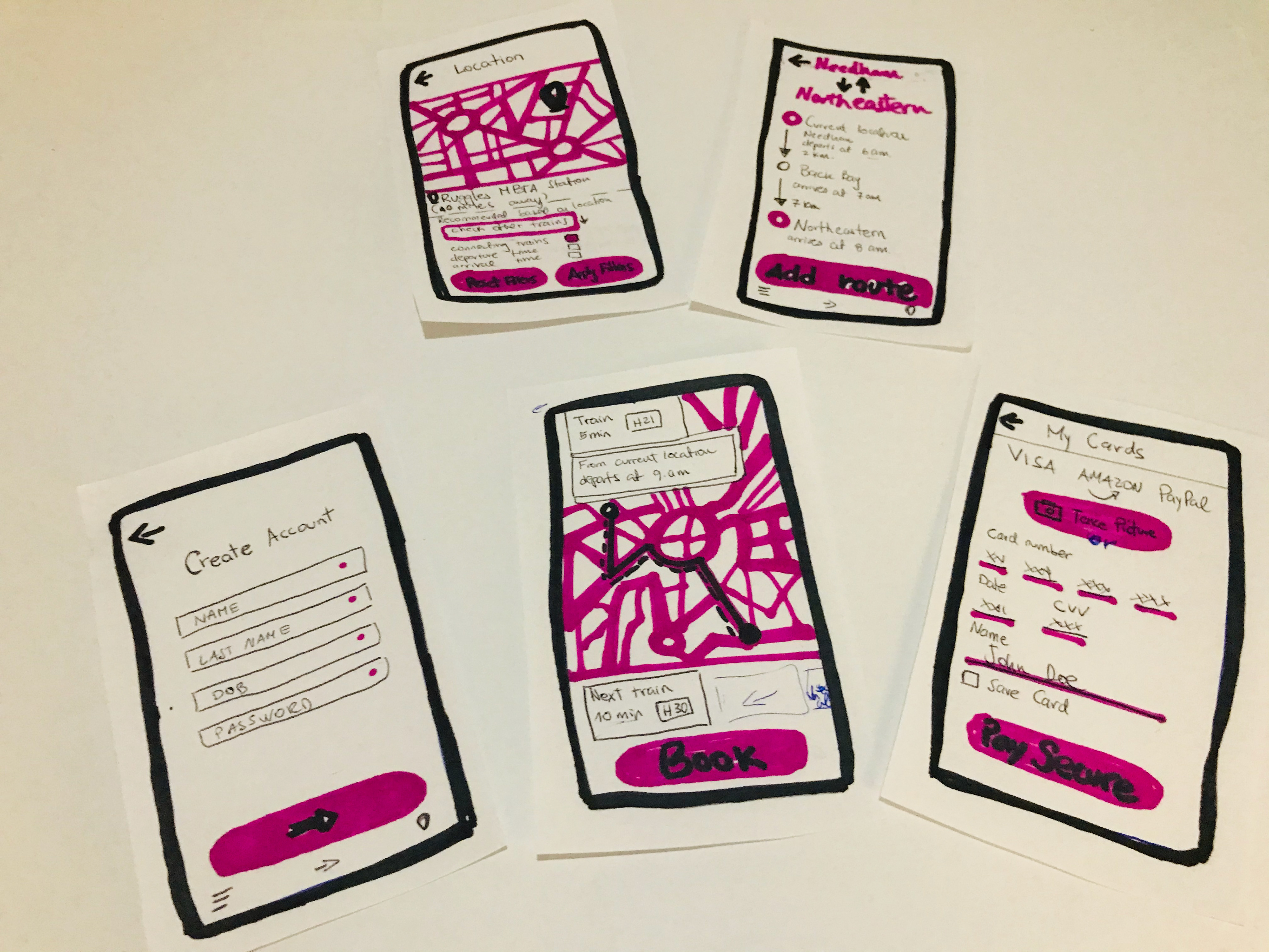
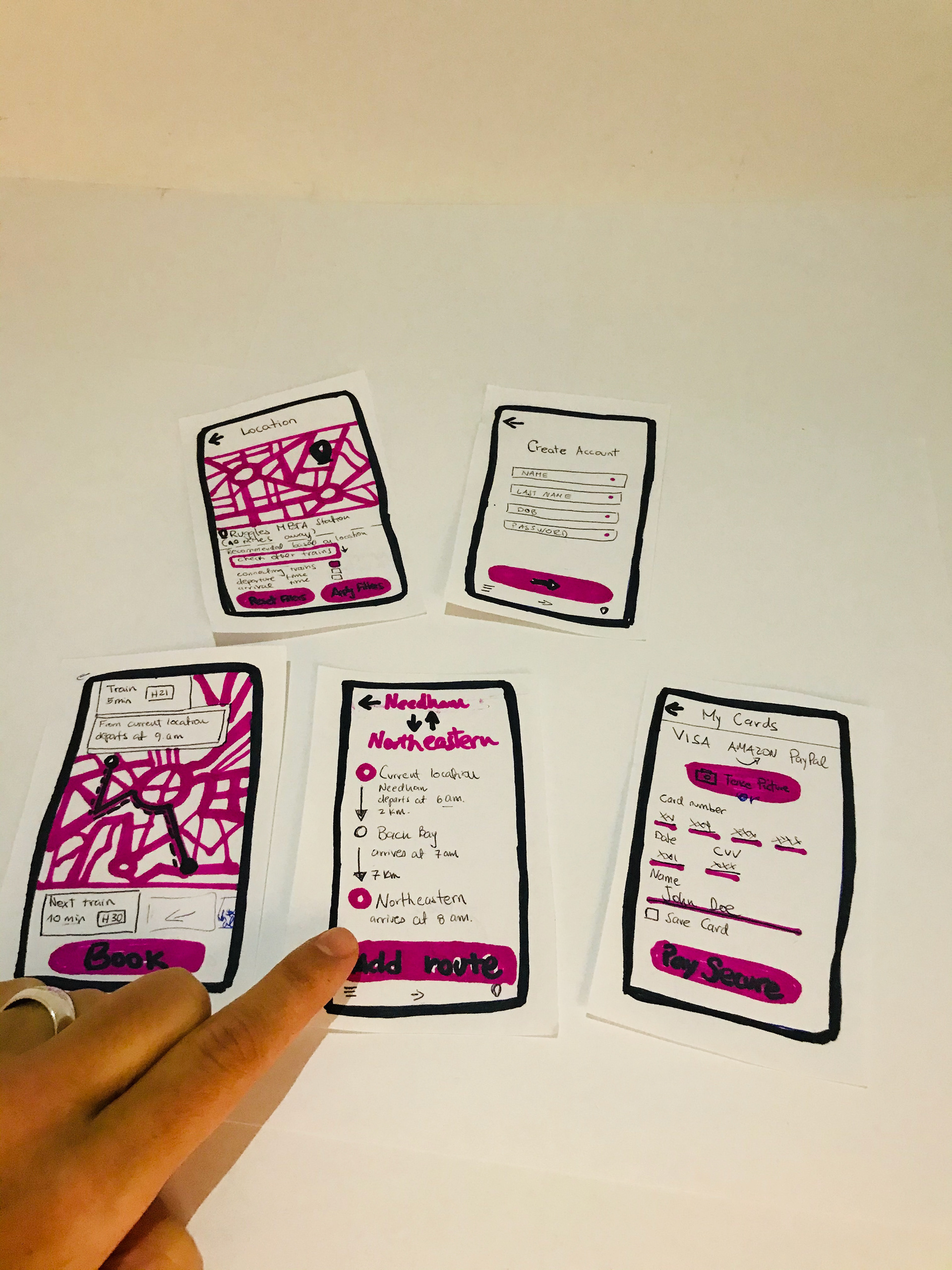
The Prototype
My Commute-app
Design Process
A user experience design approach | paper prototype & user testing

Learnings & Insights
It would be good to be able to just navigate without creating an account.
Maybe one time users?
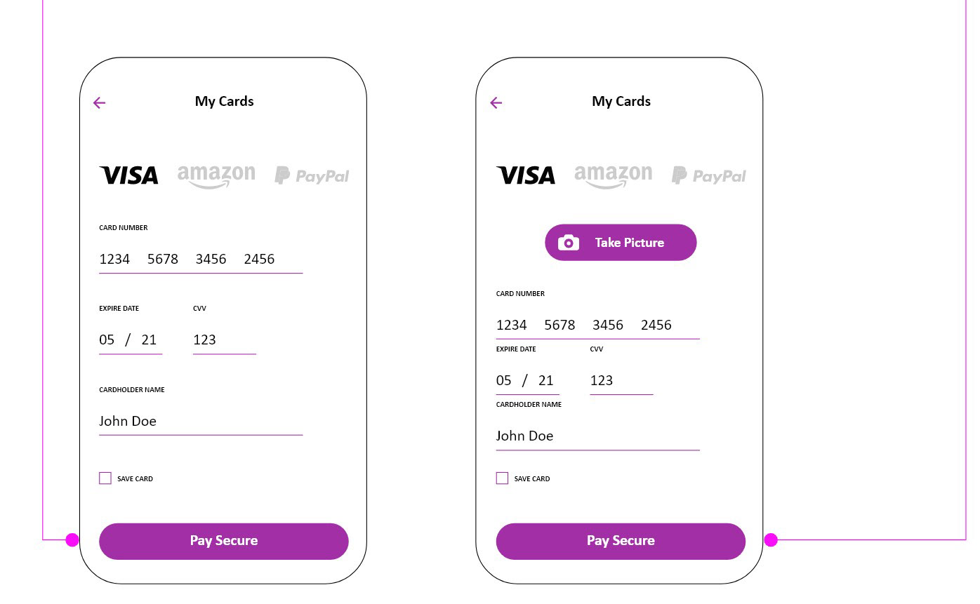
Picture from card it's easier.
It would be better to see more options of trains
When showing the route, add a book button to book right away, maybe people are in a hurry
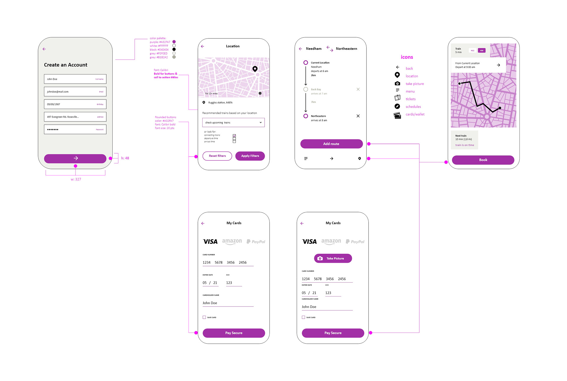
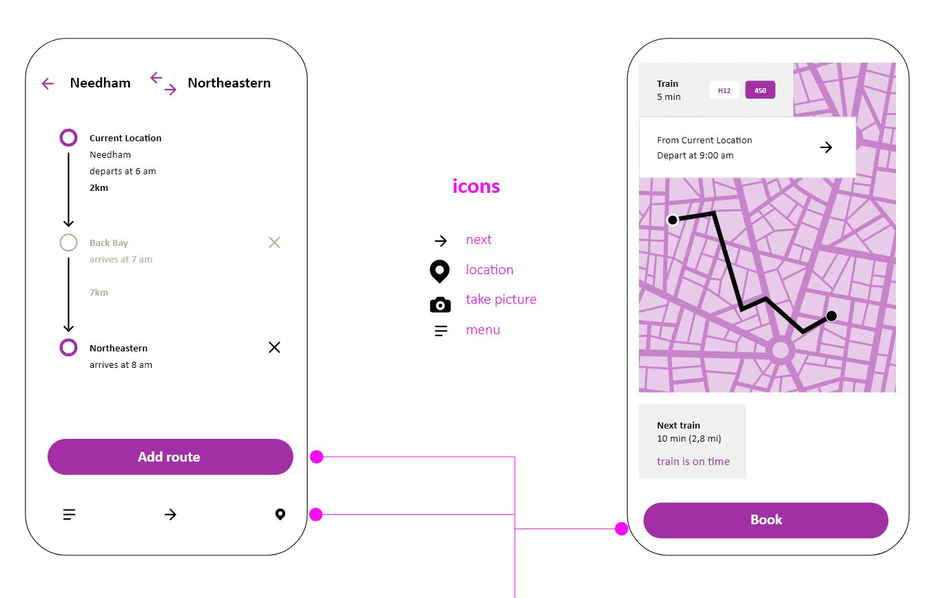
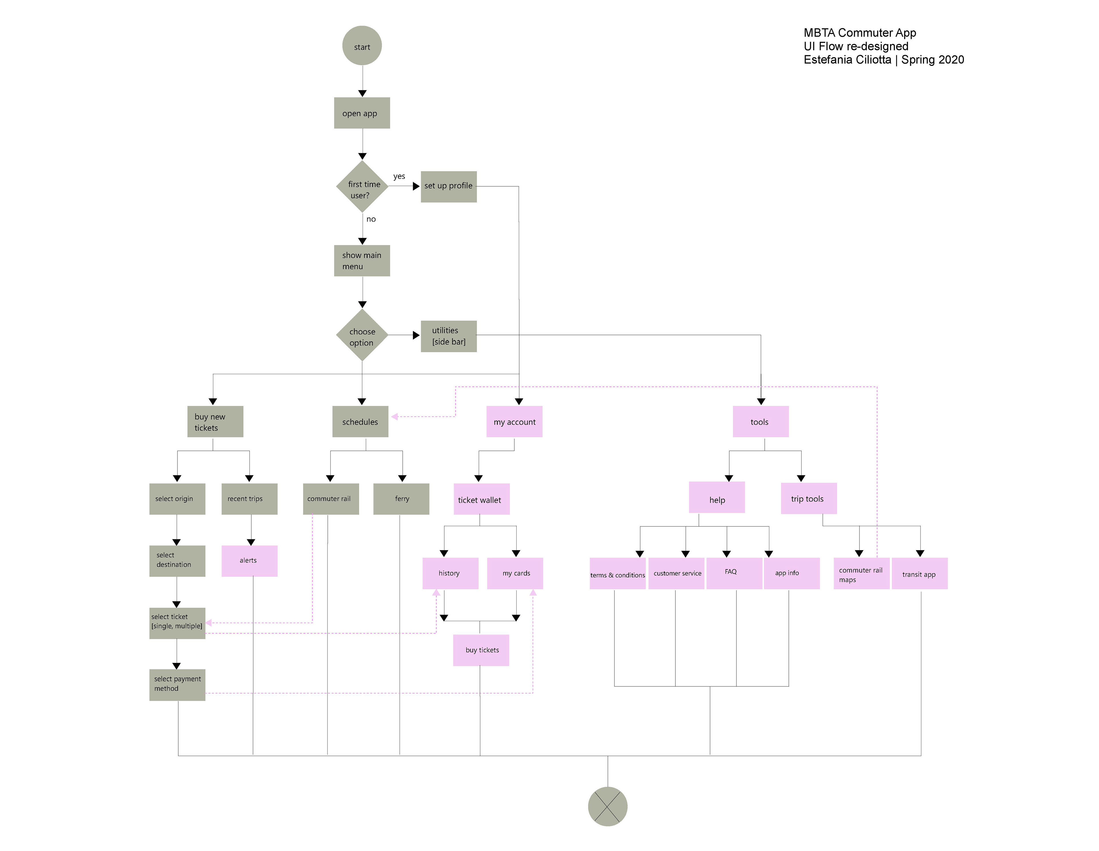
UI Flow
UI Spec

VD Spec